Tuesday, 29 November 2011

A Selection of Pictures taken at the INPUT Gig!


These are a small selection of pictures from the Battle Of The Bands gig hosted by the Input Company.
The reason for choosing these pictures is that they could possibly be used for the front cover, the majority of them could be edited into a MCU and that would work perfectly since it's exactly what I need.

Friday, 18 November 2011

Thursday, 17 November 2011

Music Magazine Price

Since my target audience is for people who either don't work or have just started working, then the price of my magazine dosen't want to be too high. However, theoretically, the price does want to be high enough to cover costs of production.
From the magazines  I have researched, the prices usually range from £3 - £4.50, however their target audience is of a higher age and income, plus they release their magazine once a month. I on the otherhand would release my magazine once every month but keep the price slightly lower at around £2.50. This will hopefully cover the cost of production and also be affordable for the auduience.

Target Audience for my Music Magazine!

The demographics of my target audience would be  mostly males because, my magazine is about young, aspiring musicians hoping to promote themselves, the majority of the musicians featured in the magazine are male so the audience could then relate more to the acts but also, males are more likely to be productive and work harder to make something of themselves. (Without being sexist.)
The age of my audience would be people aged 15 – 24 and this is because people of that age are still deciding on what they want to do in life, and my magazine is made to inspire and push those into ‘following their dreams.’
The S.E.G of my target audience would be between groups E – C1 and the reason for this is because of the demographics I have chosen. Young adults are less likely to have a high income as they are probably still in full-time education. Since this is my S.E.G, I will have to think about price of the magazine because, if my audience have a low income and the magazine costs a fair bit, then they are less likely to splash out on it.
As for the psychographics I will aim my magazine as achievers. My magazine is all about talented people wanting to make something of themselves, which is what my target audience want to do. They will be able to relate to the magazine, be inspired and possibly try to begin their career as a musician.

Monday, 14 November 2011

Existing Magazines (LIIAR Analysis)


Q Magazine

L - To start off with, on the front cover you definitely see the masthead. There is nothing much to the masthead which is what makes it so effective. Due to it's very small title and simple logo it is easily recognizable and when you notice it you know what the magazine is based around.

 The headline next to the masthead catches the eye of the reader due to it's large and bright properties, this headline related to the main image on the front cover and also helps advertise the main article of this issue.

 To give the reader more detail as to what is 'in-store' for them inside, there are a number of decks under the main headline to give the reader a little more information.

The main image grabs the attention of the audience, because it is so bold but also, the man in the pictures looks as though he is staring right at you and this catches your eye. This is a great convention for music magazines as the audience can quickly determine who the person is and then go on to read about them.

On the side of the page are thumbnails, this gives the reader more information about what is in the issue and advertise other articles. The head of the thumbnail is written in black to enforce the main information, this catches the readers eye, then you go onto reading the sub-title in grey. This colour scheme defines main points of the thumbnail but also prevents the magazine from looking plain.

The house-style of the magazine are the colours red, white, black and grey. All these colours work well together, similar to a newspaper article however the bold red colour highlights key points throughout the magazine, for instance, on the double page spread the questions are in black and the answers are in red. This guides the reader through the interview to give a better idea as to who said what. The house colours work well together because they are simple and yet appealing to the audience, similar to how the magazine wants to portray itself. However, on the contents page and double page spread, several uses of gold appear, and this gives the magazine a more modern feel as well as highlighting key features in the magazine.

The barcode at the bottom shows this is a professional magazine however, the colour red is used to outline the price of the magazine, this attracts the audience to the main point of the barcode.

On the contents page, names of people are written in bold so people will notice who the article is about, then go on to learn more, this is effective because it saves time have to scan each article for something they are mostly interested in. 

Furthermore the graphology of the contents page is very simple, it is cut into sections such as 'OASIS SPECIAL!' and 'REVIEWS' to simply the readers experience. Everything on the contents page is made easy, but also gives enough information to know where to look for a story that interests.

The main image on the contents page has a caption with a page number, this shows the picture does have meaning and can be located in the magazine, techniques such as this are effective for promoting more than just the main article on the front cover.

On the double page spread, the house-style is used effectively to outline the speaker in the interview. (Questions in black, answers in red.) Not only does this simplify the article but it also makes it look fresh and appealing. If the entire article were to be in black, then it wouldn't seem as interested, it would look as though it was long and dragged on for two pages.

Another technique used was in the opening paragraph and the use of underscores. Spacing the words out slowed doing the reading speed and adds an effect to it, despite the fact it isn't majorly important however, it does give the introduction a modern look which could be appealing to a wider audience.


I - Despite the logo and magazine name, Q magazine is not a company that makes this magazine, in fact the institution behind Q magazine is known as Bauer Media, they operate in 15 other countries. In the UK this magazine can be found in many local supermarkets and it is distributed across the country. 

I- This magazine is produced to inform readers of recent stories in the music industry, mostly in the Pop Music Genre. As you can see from the contents page, there is a wide variety of stories, and this shows that there is a lot to be found within the magazine. Also, the magazine is there to show there it more to music than just songs. Hence why it features interviews with artists, and on the front cover it makes it plain obvious that there will be some involvement with Oasis. What they want is for music to have a wider audience, and to also help advertise artists.  

A- Q magazine targets an older audience, such as people aged 25 + plus, therefore the S.E.G group would be A - C1. The reason being is because they didn't want to aim it at a younger audience because now they can talk about more 'classic' artists and also make more money due  to the fact their target audience are of a working class. The psychographics of the magazine would be people who are inner-directed (i-am-me) they like their own music, back from when they were younger, and wish to still keep in touch with that, instead of following the latest crazes and listening to what everyone else is listening to.

R- On this particular front cover, the close-up on the man shows that he may be 'annoyed' in someway also, the caption of the picture 'Oasis Are Back' could also represent the man as being angry and coming back for revenge! This is to grab the attention of the audience, to let them know that something is happening and Q magazine have the 'scoop.' However, generally, musicians in this magazine are represented as interesting yet everyday people, for instance the U2 interview on the double page spread. The introduction at the beginning of the article doesn't necessarily show Adam Clayton in a bad way, if anything it is an un-important paragraph, however, this helps represent him as an everyday person.
As the magazine features articles from many different genres, they doesn't necessarily talk down to a type of genre, for instance, people who are religious towards metal music may despise R&B, however since Q Magazine is an all-round magazine, musicians of any genre are represented positively.


 UNCUT Magazine

L - As always on the front cover of a magazine, there is the masthead. Uncut magazine use a bold, bright and powerful masthead.The colour red used stands out and attracts the audience, but also red is the colour of danger which adds to the word 'Uncut' because there is more to this magazine than just the basic information.

Below the masthead is a splash to help sell the magazine even more. 'FREE CD' is another reason as to why the audience should buy their magazine. This is effective before it gives the reader more to look forward to.
Above the masthead are teasing contents used to advertise more articles in the magazine, this shows there is more to it than just the main story on the front cover. This is effective in promoting itself and keeping the audience hooked.

As well as teasing contents there are also cover lines to advertise other articles in the magazine, these are printed in various colours to make key points and features stand out. This makes the magazine more appealing and eye-catching for the audience, but also codes different points using colours, for example, 'Uncuts top 50 albums of the year.' Has been written in blue, this represents a calm colours, so this will be a review and list however the article 'Terry Reid' has been written in red, yet again, the colour of danger, this makes certain articles give off different feelings and emotions.

The house style of the magazine mainly consists of the colours red, white and black, however on the front cover other colours such as blue and gold are introduced and this makes a more modern edge to the cover by mixing more colours in there. They highlight key areas of the magazine by using different colours, however the house style used in the magazine is more calm and professional but still makes the important information stand out. The use of colours works well in this magazine for promoting different areas and also making it simple to read.

The medium shot used on the front cover makes the image seem powerful, as though he is making a stand in the magazine, it dominates the page and attracts the reader into learning what it is about. Along with the caption 'Man of the Year' this image works very well in letting you know who and what this main article is. A medium shot / medium close-up is always very effective in magazines as it promote main articles and a good article and promotion attracts a bigger audience.

As you would expect there is a barcode and a price to go with the magazine, however it does not stand out from everything else which is a blessing and a curse in one, because you focus more on the articles and adverts rather than the price, but the price is not bold enough for the audience to see that the magazine is worth it. It seems as though they are trying to hide their price because it is expensive compared to other magazines.

The contents page uses a more simple style of colours, only red, black and white, but this works well for highlighting the titles and sub-titles of what is in the magazine. Sections of the contents, for instance the reviews part, is made bolder by the colours, this segregates to section so it's easier to find what you are looking for. It also gives the contents page a professional layout and keeps the magazine from looking boring.

As for the main image and caption, this gives you more of an insight into what is in the magazine, this is a good convention to help sell the magazine more, people usually see images before they see words, so making a bold image such as this one is effective.

The double page spread uses a lot of bold text to highlight key points and quotes in the interview. This technique will grab the readers attention at looking at the most interesting points of the article, making them want to read more.
The medium close-up of Paul Weller makes the article more clear for those who don't know who he is. By putting a big picture of him next to the interview, it's almost as if you are at the interview with him, asking the questions and hearing his response. The eye contact with the image is effective in portraying that you are actually there.

I- The institution is 'Uncut' magazine, and they have created several spin off magazines from the original Uncut title and they are still an on going magazine.

I- The idea behind the magazine is that is has the 'scoop' on the music world, and their headlines are their to prove it. They want the audience to think they know more than any other magazine and that nothing is hidden. The title 'Uncut' is to represent that nothing is missing and in a way, they call the shots.

A - The target audience for the magazine seems to be people of an older generation. Most of the articles in the magazine are of classic musicians such as Paul Weller. The demographics would be of male, aged 25+, which therefore means the S.E.G group would be A - C1 because people of this age group will be earning a pretty decent income. The psychographics of the magazine would be people who are inner-directed and want to know what is happening in the world but also stay in touch with their classic side.

R - The representation in this magazine is that there is more to music than just the songs. Giving Paul Weller the Uncut Award means that there is more to his songs. The magazine wants to represent musicians into more interesting people. The colours used also represent danger, that the information that Uncut behold is just unbelievable, so the cover title 'Terry Reid - How he escaped from Led Zeppelin' represents this as a dangerous and dark story. Generally though, the magazine promote the musicians and represent them in a good way.

Sunday, 13 November 2011

Music Genre :)

The music genre I am going to focus my magazine around is 'pop music.'

I have chose this because a lot of pop music is aimed at a younger audience and also, many aspiring musicians make their own cover versions of songs and these people will be featured in my magazine. This will help promote a positive image of youths, and also keep the magazine up--to-date and interesting. 


Pop Music Artists (According to iTunes)

Adele


Lady Gaga


Jessie J
Tinie Tempah

Beyoncé


Wednesday, 9 November 2011

LIIAR Analysis of the Brief!

L - My product needs to look professional, be eye-catching and also meet the requirements. Like most music magazines, there needs to be a masthead that is recognizable, short and effective. Just a simple letter could even work (e.g. Q magazine) as long as it is dominant and eye-catching.


The main image on my front cover needs to be a MCU (medium close-up) but you need to be able to see the person's face and have 'eye contact' with them. This will attract the audience and show what the main story is for this issue.


The colours used must be bold, bright and work well together. A good house style will make the magazine more attractive and more professional. However, the house style I use must be consistant through all my products.


Despite the fact my main image is will be the selling point of the magazine, thumbnails around the side of the front cover grab more interest as it illustrates more articles within the magazin however these can also be placed in the contents, so they can go along with the page information.


Along with the main image needs to be an achorage. If the audience don't know what the image is about, they may not want to spend money on something that doesn't sound / look good. A good anchorage will help promote the main article.


A price and barcode is always needed in making a magazine look professional, the barcode will be clearly visible but also out of the way to make room for the main image and thumbnails. The price needs to be a fairly reasonable price, but enough to make a profit.


With the main image, thumnails and masthead, another way to attract the audience would be to have teasing contents along the bottom. This will fill the page more and make the whole magazine look busier, also along the bottom a competition could be advertised somewhere on the front cover or maybe in the contents.


I - I would create my own institution, however, use similiar aspects featured in 'Q Magazine.' The same sort layout and information would be used throught however, there will be some originality in my products.


I - I want to get the messgae across that young musicians today are making a postive image for people their age. I want the magazine to be inspiring as well as interesting.


A - I want to aim my magazine at 16 - 25 year olds, S.E.G group C1 to E and people who are 'outer-directed' and want to achieve. The reason I have picked this specific target audience is because, young people are more interested in music now-a-days and are also easily inspired. If they wish to become musicians themselves when they are older, my magazine will help promote musicians and inspire many readers.


R- I want the magazine to represent the target audience in a positive way, e.g. Youths would be promoted as 'inspiring musicians' rather than 'intimidating thugs.' However, the magazine will still be musically inclined and interesting rather than some gossip magazine.

New Brief! MUSIC MAGAZINE!

Main task: the front page, contents and double page spread of a new music magazine (if done as a group task, each member of the group to produce an individual edition of the magazine, following the same house style).

Friday, 4 November 2011

Front Cover, Audience Feedback

Below are a range of questions I asked my target audience about my college magazine.

1) First of all, is the magazine eye catching?

The majority of the people I surveyed agreed that my magazine was eye-catching. They said that the effect used on the main image was a nice touch to the magazine front cover and made it look fairly professional.
2) Does the magazine look professional, and could you see this on sale someday?
The audience all said that they could imagine the magazine to be on sale someday and with a few final touches, it could really look like it belongs in an everyday shop and college.

3) Is the text clear enough on the front cover and contents page?
The people I surveyed all said that the text could do to be a different colour or just made clearer on both the contents and front page. However, the main information is legible and it still makes a good product.

4) If this magazine were to be on sale, would you buy it?
The magazine itself does look intersting according to the audience, however, the price seems random and an annoying amount to have to pay. "You can't just simply pay with one coin, and the chances are you'll always get that annoying penny back every issue." One person said.
Other comments made:
"Good magazine, I like the house style but some of the text needs to be easier to read."

"The way the price is stated is epic. It adds a sense of professionalism to the magazine. Also, the barcode looks realistic and the time the magazine is issued is awesome."

"I wouldn't particularly read it, but it definitely is eye-catching and a good product. It's full with plenty of headlines and stuff to catch the readers attention."


Thursday, 3 November 2011

Final Cover, Contents and Evaluation


Thanks for the feedback! :)

EVALUATION

LANUAGE
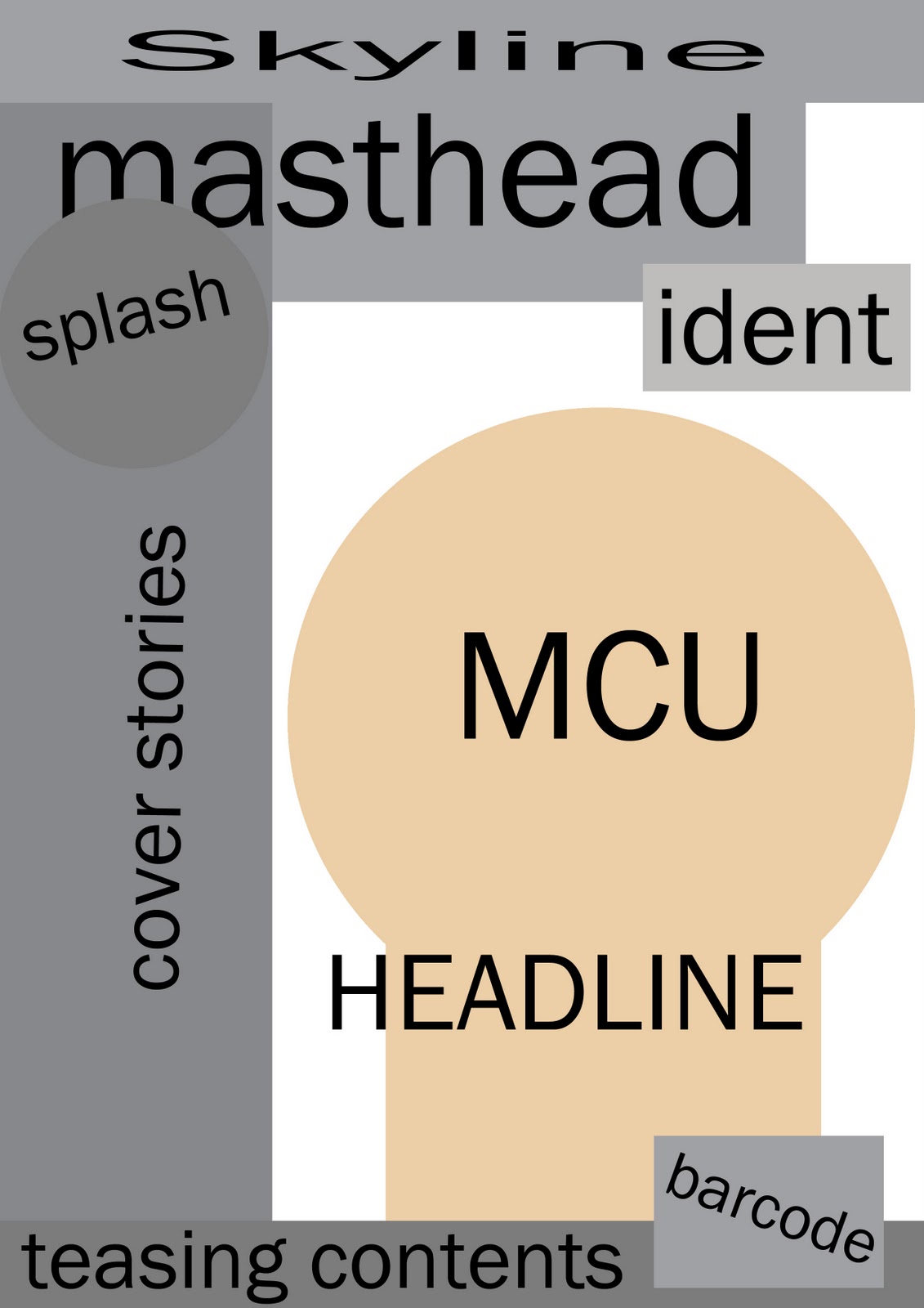
The task I was given to do, was create a college magazine featuring a medium close-up. To help me create my product, I took ideas from already existing magazines. For example, the masthead I used was influenced by the masthead of GQ magazine. It is clearly visible, short and recognizable.
I wanted my magazine to look interesting and full of ‘the facts’ which is why I created a deck of headlines on the side of the magazine. However, these were not the main selling point of the magazines; instead it was the main brand image of the medium close-up I used followed by the caption below. The caption was meant to seem ‘action-packed’ and ‘epic’ in a way, to grab the attention of a younger audience. The colour used for the brand image was also meant to add a sense of enigma to the cover, “who is this person and why are we reading about him?” Making the audience want to read more.
At the bottom of the page, I used a teasing content to help draw the reader in even more by letting them know there are big prizes to be won in a competition. Everything I did used a younger style of writing, it was still formal but the way titles and caption have been written can be relatable to my target audience. For example, in the contents page for the ‘money saving guide’ the headline reads “Make your moolah and keep your cash!” This is an informal heading, but the audience can relate to it, also, the use of alliteration is eye-catching and attractive.
The overall layout of the front cover was meant for it to be clear as well as full. This will give off the impression that it is easy to read, interesting but there’s a lot of it. The house style used is mostly based around the college colours (purple and green) alongside more vibrant colours which are red and white.  From what I have gathered from audience feedback, the house colours worked well, with everything to do with the college in the college colours, and the important and serious topics in red/white.
To ensure people understand this is a Wyke Magazine, the college name / logo was placed as part of the barcode, along with the date and price. The price was also featured in the top corner, this is placed to attract the audience and make the product seem cheap by segregating it from the rest of the headlines/articles.
On the contents for page 14 it reads “It’s competition time!” This was initially in white, but due to the background I had to change the colour of the text. However, it also helps make it stand out more as the competition is a main selling point to the magazine as it will not be available online. (As stated on my blog.)
INSTITUTION
The institution that will promote/publish my product is the featured college itself, Wyke 6th Form College. The magazine will be placed in the library for people to buy and read, this is a good place for my product because the main place people go to read or ‘learn’ in the library.
The reason I have chosen Wyke is because it was easier for me to complete my product there, due to the amount of images I can take there, as well as a large amount of my target audience have places at Wyke. I want students aged 16 – 19 to buy my product, and featuring it at Wyke is the perfect place.

IDEOLOGY
The main idea of the magazine is that it was meant to seem as though it is made ‘for the students.’ Once the magazine learns something new, then so do the students. It was as though the magazine was on the same team/side as the students, which is why the slogan above the masthead reads “We know it. Now you know it.” Everything the magazine learns the students must know as they have a right to know everything that goes on around them. It almost makes the magazine seem like a rebellious, ‘freedom fighter’ and youths of today like that.

However, this may be portrayed as making out that students are just thugs and rebellious, which is why teachers are also involved within the magazine. The last thing the magazine wants to do is creating a negative image for its target audience, but also makes it relatable.
AUDIENCE
My target audience is students, aged 16 – 19 studying at Wyke 6th Form College, and the way I attracted the audience is by having the brand image on the front an everyday student.
My target S.E.G group is group E because the students are still at college and probably on a low income, also, The psychographics of my target audience will be achievers because, people who aim to do well will want to know what is going on around them and in the college to get a better understanding of how to aim higher and do well for themselves.
REPRESENTATION
As the magazine is about and for students / youths they need to be represented positively however relatable in order to attract the audience, hence why the language is more informal than a normal everyday magazine.
The brand image being black and white, may make the person in the image look like an individual and possibly rebellious by standing out from the crowd, but that is what the magazine wants to do. It wants to be different and stand out from all the other magazines. By making the brand image seem rebellious, it is succumbing to the everyday stereotypes of the youth of today that the media portray.
The slogan at the top, ‘We know it. Now you know it.’ Is it way to show how they magazine beholds a lot of information. However, the meaning behind it, is that it is meant to show that the magazine is siding with the student in whatever they do. This makes the audience want to help out their ‘friends.’
As the magazine is based around the Wyke College and what is happening within it, the house colours are the same as the college colours. This shows a relation between the magazine and the college, and this promotes my magazine even more.
The backgrounds I have used for my cover and college magazines are of one of the college magazines. It is a part of Wyke, just like the magazine itself despite the fact it isn’t the first thing you would associate with the college. However, the meaning behind the image is to show that with this magazine you’re going to get a lot more than you paid for.
The masthead also uses the college colours to show they are related, but also, in between the letters of the masthead, there is a lightning bolt. This represents power  and how nothing can stop this magazine from telling the truth.
Overall I am happy with my product, both the front cover and the contents page. I feel I have made a good attempt at trying to make my magazine look professional. I would have liked to put more detail into certain areas, however for the skills and abilities I have I am pleased with the work and feedback I created and received.